Renovar Jewelry is located off the Las Vegas strip, and offers a curated selection of authentic pre-owned name-brand jewelry. The goal of the logo was to have both unique and identifying aspects of the store represented in a modern way. The “O” in Renovar drawn as a diamond ring but also is an arrow to represent the reselling feature of the brand.

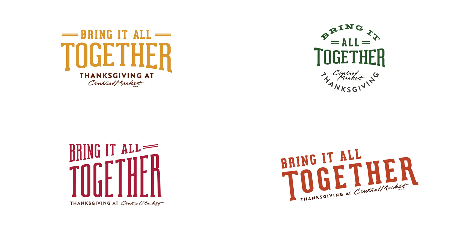
Central Market’s Thanksgiving required a dynamic event logo to fit in various cooking utensils, from a baking sheet, an oven mitt and even a cast-iron skillet.

Cubeta Clarke is a law firm started by two women best friends. The dynamic duo combined their many years in the field to create the strongest and smartest group around. The concept for this mark was inspired by the game of chess, when you have acquired two queens in the game, you have the best chance of winning.

Rummy Rio Red Grapefruit soda has an eccentric twang from the Southwest. The geometric logo and character making was inspired from papel picado.

Literacy Achieves is a non-profit organization that teaches non-English speaking adults and children English literacy to promote self-sufficiency in the United States. The program promotes communication as a priority in the classroom.

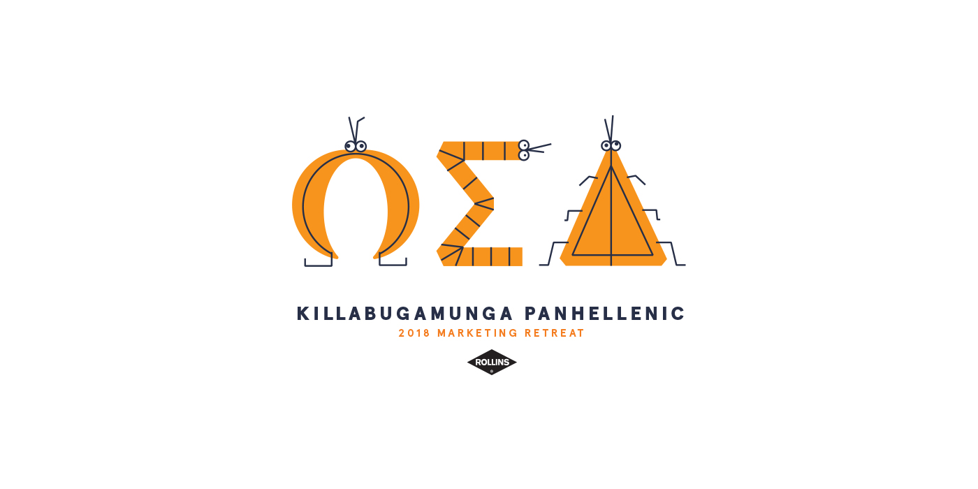
Every year, Rollins–Orkin holds a retreat for their marketing team. The weekend consists of brainstorming for the upcoming year, a little fun and a lot of booze. This year, the retreat was held in Athens, GA and they selected theme of academia, fitting since they were in a college town. The logo represents a fake fraternity with the Greek letters made out of kooky bugs, since they’re all Rollins–Orkin is all about bugs.

